
Two interesting infographics from The Visual Capitalist. The first showing the distribution of GDP around the world and the second, the size of the global middle class both now and where it’s headed by 2030.
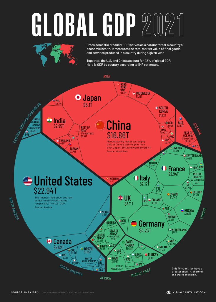
Do remember that GDP is a flawed index, but ignoring that, what pops out to me on this graphic is just how insignificant the oil wealth of the Middle East is in comparison to North America, Europe, or Asia, and how tiny the economics are of Latin America and Africa, barely bigger than Canada or the UK.
Over on this infographic, what is missing is where in the world this growth is mostly going to come from. Hans Rosling explained that years ago. The big jump is going to come from the poorest countries, and thus from Southeast Asia, Latin America, and Africa. So basically the growth will come from the geographies that are tiny in the first graph.
Finally, tying these two together, note that while GDP is usually talked about as total production, it is at the same time total spending, and thus the “SPENDING” in the second graph is the GDP from the first graph. The second infographic is thus predicting the “pie” in the first graph will grow by 42% by 2030, just eight years from now.
The more those tiny seconds on today’s GDP graph invest in domestic production, the more of that growth will stay in those countries and start to balance out global GDP.