It is conference season once again and the world is back to large face-to-face conferences. The one benefit from the pandemic is that the software for conferences is greatly improved, as the conference software companies were forced to re-think the online conference experience.
The result is much better, but still far from great. Below is where it is failing and ideas on how the experience can be greatly improved: (my credentials for this advice is 20 years as CTO/Chief Architect for four software companies, the first dating back prior to the Web, most focused on a mobile-first experience).
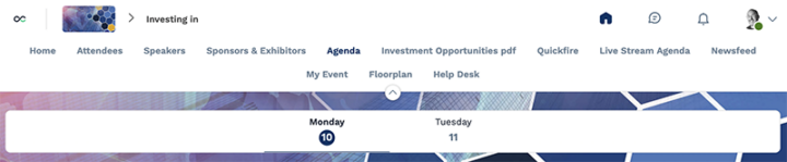
A- First and foremost, the software providers need to understand that there are two reasons why people attend conferences. One, to learn. Two, to network. Most of the conference software is focused on the learning, i.e. the keynotes, panels, etc. The “Agenda”. They do a reasonably good job there, as the agenda is just a linear list of events with dates, times, descriptions, and speakers. Most software does nothing for networking other than an Attendee list, but more and more I’m seeing software that solves 80% of the problems of networking.
B- At a typical 2-3 day conference I typically manage to have around 20 face-to-face 20-30 minute minutes, all pre-arranged before the conference starts. Typically it takes a lot of LinkedIn connecting and some in-software messaging to arrange all of those. At the conference I attended this week, the software provided a system for picking time slots, and with that I managed to arrange nearly 50 meetings in two days. That was intense, but it made me want to attend again next year, bringing an extra colleague, which is exactly the result the conference organizers want.
C- Networking starts with a good Attendee list. The best software integrates to LinkedIn, not just creating a LinkedIn link but pulling down the current position and company from the attendee, so that they don’t have to do that manually. Weeks before the conference, I go through every attendee, reaching out either in-system or on LinkedIn to everyone I don’t know who looks interesting. Emailing those I already know who I’d like to meet for an update. Ideally, all that is in-system, with the Attendee list sortable by when their profile is created, as some people join in only a few days before the conference starts, and I otherwise miss them in my prep.
That Attendee list should have page by page navigation, not an infinite scroll. The auto-scroll might be nice for small events, but the conference I attend have over 1,000 attendees.
In the web view of that list, the entries need to be clickable so that I can open them into separate tabs. Too often the HTML/CSS/Javascript is written so that only one Attendee at a time can be viewed. Sometimes because attendee details are pop-ups. Sometimes for no good reason.
D- The conference I attended earlier in the month was virtual, and its software complained whenever two windows were open at once. Whoever thought of that should be fired. At a minimum on my laptop I want to have one window on the Attendees, one on the Agenda, and one on the Messaging system. During a virtual event I want a fourth on the current talk.
That software so desperately wanted a single window experience that various parts of the UI could be opened and closed in columns, with up to four columns visible at once, which made none of the columns wide enough to be easy to use. Whoever thought of that should be fired, re-hired, and then fired again. Browers have tabs. Use them.
E- Viewing attendee details should be possible from the Attendee list and from the list of speakers in the Agenda and from within the Message system. Again, I should always be able to open those details into a new tab. On that page should be a way to “connect” with the attendee, with an optional opening message, just like on LinkedIn. Connecting SHOULD NOT require me to pick a time to meet.
F- When registering with the system, each attendee should be asked if they planning one-on-one meetings. If so, then upon connecting with an attendee, that detail page should include a method for picking a time to meet. The best software integrates that into the “My Agenda” feature, so that the time slots for bookmarked talks are taken out of the list of choices. One piece of conference software lets each attendee manually remove time slots. That is useful for virtual conferences when some slots are after 2am local time. That is useful for in-person conference too, as not everyone attends every day.
The ideal UX is one person suggests a time, and the system guarantees they are available, avoiding any back and forth negotiations. But that can never be perfect, so the software should also provide three choices to the recipient: Accept, Propose New Time, and Decline. I’ve set to see any software include the middle option.
G- Conference organizers should include a “Meet Here” banner in an obvious location and the software should point all these 1-on-1 meetings to that location. The software should integrate the conference map in the notification system to help educate attendees where to find that rendezvous location. These are short meetings, typically just 30 minutes at best, 20 minutes in reality. Every minute lost trying to find someone is time lost to networking.
The Attendee profiles should pull in the picture from LinkedIn. That helps with the meeting rendezvous. Best (which I’ve yet to see) is the use of Bluetooth on the mobile conference app to vibrate when you are near your meeting counterpart.
H- Once two Attendees are mutually connected, the conference software should let them message each other, with no limits. That Messaging feature should be easy to find and easy to use. Too often it feels like an add on. At the latest conference, it worked as expected, but in both the web and mobile versions of the software, once you entered the Messaging system, the Agenda, Attendees, and other navigation links were gone. In that mobile app, it was five clicks to flip between “My Agenda” and Messaging, which are the only two featured I used to see who I was meeting with next and to coordinate with the next person for the rendezvous.
Many others at the conference gave up on the built-in messaging and were just using WhatsApp. I’ve yet to see WhatsApp integrated into conference software, but that would be ideal. In the software registration, ask the attendee if they would prefer to message using WhatsApp, or iMessage, or SME (and email or the software itself), and let them use that. The software should act as a bridge between attendees who pick different systems.
G- Speaking of “My Agenda”, even better would be integration with Google Calendar, both for the talks and all these meetings.
That would then lead to the ultimate UX, which is the conference software for the Attendee list and Agenda, all before the conference starts, then Google Calendar and WhatsApp during the conference itself for the talks and networking.
H- The above features done well would meet the needs of most Attendees and reach their exceptions of success. But it is possible to build a few more features that would go above and beyond expectations.
Audience chat. Once and only once during all the virtual conferences was there a conference software that made in-system chat visible and easy to use while the talk was streaming. The result was a second conversion between the Attendees while the speakers on the panel where having theirs. At a good conference, the audience has meaningful information to add. The chat on Zoom is hidden by default, and the same is true for most conference software. With that, I’ve never seen the same level of interaction as that one event. That software changed their UI months later, and the second version failed to trigger the behavior I saw that one and only time.
Conference-wide discussions. Pre-pandemic there was one conference software which allowed Attendees to post short messages to all Attendees. The UI was Twitter-like, but with a title to the post. Replies were like a Twitter stream. The default UI was a two-column page, topics in a 1/3 wide column sorted by most recent reply, content of the thread in the 2/3 wide column on the right. At the 2,000-3,000 person conference I attended, by Day 1 there were usually 100 topics posted and during the conference the Attendees would often create their own table topics over breakfast or lunch using that system. I’ve not seen anything like this in the post-pandemic conference software.
As is typical of software development, it is realatively simple to create something good, but far far more work to optimize the flow to create a great experience. I wrote this post hoping that it helps get to great by 2023 instead of many more years of extra clicks and missed networking opportunities.